Branding
Create a positive and lasting first impression
- Keywords:
- brand, brand guide, branding, corporate, identity, logo, logos, logotype, symbol, wordmark
- Last updated:
- 2023.01.23
- By:
- Nikash SINGH
Branding is the consistent application of a unique aesthetic across all of a company's physical and virtual assets. Most commonly it involves the creation of logos, motifs, fonts and style guides. But it also encompasses merchandising, packaging, promotions, software/sites, Email campaigns and any consumer touchpoint you can imagine.
Good branding impresses and intrigues before you've even said a word. Conversely, poorly executed brands can drive away customers within seconds. In a modern competitive environment where competitors are just a click away, that is the risk any company ignoring their branding takes with an increasingly brand-perceptive market.
Common output
Logosicon-down
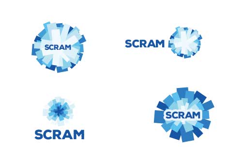
Logos are the most common focus of branding projects, and with good reason. A logo is the single most valuable, visible and identifiable asset in a company's corporate identity. Good logos are memorable, versatile and form a strong basis from which all other visual assets will derive. Having a poor logo makes all subsequent Design work look out of place.


Motifsicon-down
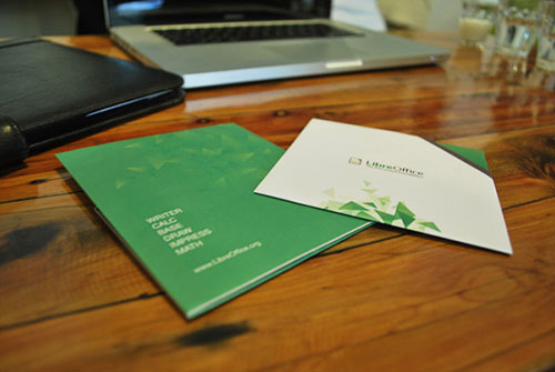
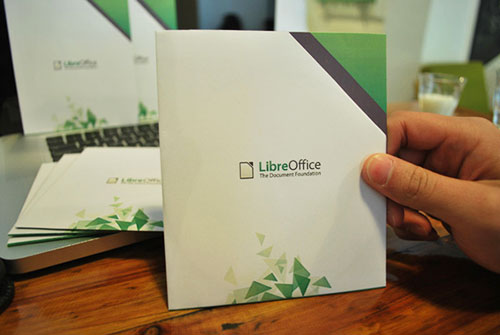
Motifs are abstract graphics that reinforce the aesthetic of the logo. They are often used as backgrounds, borders, overlays and textures. They enhance a brand's sophistication because they alleviate from having to re-use the logo on the page, which can seem assertive or monotonous. Below is a motif I created for LibreOffice, the green tumbling triangles are based on the "dog eared corner" of their logo. Here it's employed on paper CD packaging I created to reduce plastic.
Brand guidesicon-down
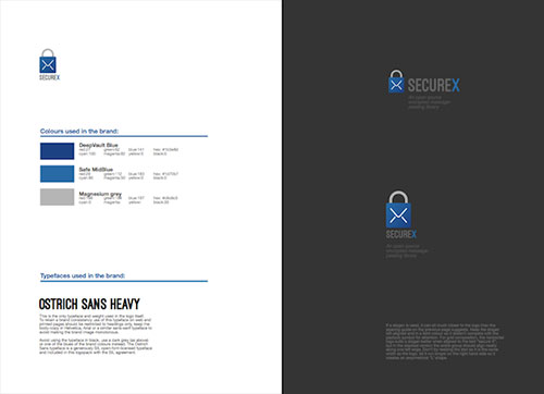
A consistent application of colour, typography and imagery is the hallmark of a strong corporate identity, but this should not be left to chance. A Brand guide is a document specifying colour codes, fonts, approved iconography, tone of voice and on-brand imagery that the whole company can apply. It empowers your staff to propagate a consistent, reliable and professional brand.
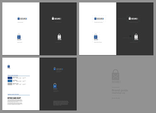
If you have a large organisation requiring sub-brand and master-brand strategies, the brand guide becomes even more important for aligning your team on how and where to apply each tier of the brand to make the hierarchy clear.
Impressions
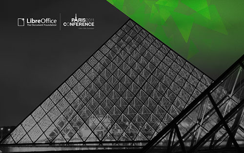
There's a common assumption that "No one will base their decision to do business with me on something as simple as a logo", and yet consumers do it every time they browse search results, product listings and social media. Every time they pick up a product based on the appeal of its packaging or draw conclusions on the sophistication of a company from a business card or sign. And the science backs this (below), consumers have become incredibly quick at detecting professionalism from increasingly subtle cues.
Not convinced?
Accenture released findings in 2001 that revealed "a reputable brand" was the single most important buyer influence 1 well before the remaining factors of service, price and product variety. Beyond the now widely circulated finding that a first impression takes only 50 milliseconds and therefore is almost exclusively non-verbal 2, there is consolidating evidence that online audiences only take 2.66 seconds to first fixate on a website 3 and may develop enough of an impression to leave within 10-20 seconds 4. A study in the UK on establishing trust online found that 83% of responses regarding rejection of trust focused on visual presentation 5. It is growing difficult to refute that visual quality is a crucial factor in first impressions and initial judgements of quality.
citations on this page ...
- TAYLOR & HUNTER (2003). '...Satisfaction, Brand Attitude and Loyalty...'
- LINDGAARD et al. (2006). 'Attention Web Designers...'
- SHENG et al. (2013). 'Eyes Don’t Lie: Understanding Users’ First Impressions...'
- NIELSEN (2011). 'How Long Do Users Stay On Webpages'
- SILLENCE et al. (2005). 'Guidelines for Developing Trust in Health Websites'

